Enhancing Website Accessibility: A Case Study on Phantom
| Fenna de WildeThe moment I was introduced to the concept of accessibility was back in my bachelor's days when we had a guest speaker who was blind. It was a real eye-opener for me when he showed us how frustrating it was for him to use any website. Honestly, it was a bit shameful for me because I felt responsible for the problem.
Throughout my career, there were only a few times when it was mandatory to make a website accessible. This emphasizes how accessibility is still far from being the standard and how important it is to give even more attention to this issue. Instead of waiting for it to become a requirement, we should proactively take the lead ourselves. As designers and developers, it's our responsibility to create websites that are not just visually appealing, but also accessible to everyone.
We've recently launched the website for our client, Phantom – which serves as a perfect example that accessibility doesn't have to compromise the beauty and joy of a website. We integrated a range of measures to enhance its accessibility, and it was also awesome to see that the client was really into accessibility as well. I would like to walk you through all the measures we took, which you can easily integrate into your own projects.
The purpose of this article is not to insist on full WCAG compliance but rather to highlight the impact that simple measures can have in enhancing website accessibility.
Tech stack:
- Next.js, Typescript, Emotion, Jotai (frontend)
- Framer Motion, Lottie (animations)
1. Focus state for keyboard users
Not all users interact with a user interface using a mouse or touch input. Many people, like those with motor disabilities, rely on keyboard navigation to access and interact with web or mobile applications. Focus states provide a visual indication of which element on the screen is currently selected, allowing users to navigate through the interface using the keyboard more easily.
Make sure you have a standard focus state in your project that's easily
noticeable for keyboard users. This can be a bold outline with a distinct accent
color. The color should stand out from the background and other elements, making
it clear and visible. You can add a focus state by using :focus-visible, a
newer pseudo-class that specifically targets elements receiving focus in a way
evident to the user, distinguishing between keyboard and non-keyboard
interactions.
/* Standard focus state for all elements */
*:focus-visible:not(.custom-focus) {
  outline: 4px solid var(--red);
  border-radius: 32px;
}
At times, you might prefer a customized focus state for an element instead of
the standard one. To address this, we've introduced the custom-focus class.
When applied to an element, it will be excluded from the standard focus styling,
allowing you to implement your unique focus design.
const ButtonDownload = ({title, type, onClick}) => {
  return (
    <Button type={type} onClick={onClick} className="custom-focus">
      {title}
    </Button>
  );
};

const Button = styled.button`
  width: 100%;
  height: 100%;
  border-radius: 24px;
  transition: border-radius 0.3s ease;

  @media (hover: hover) {
    &:hover,
    &.focus-visible,
    &:focus-visible {
      border-radius: 200px;
    }
  }
`;
2. Keyboard navigation for carousels
We use Embla for our carousels, which is a great library but doesn't provide any accessibility out of the box like keyboard navigation, ARIA roles, and focus management.
Without customization, focused interactive elements in slides that are outside of the viewport will not be visible to the user. Thankfully, David, the creator of Embla, generously shared an extra snippet of code to make the slider tabbable.
This code snippet includes a 'focus' event listener on each slide. When a slide gains focus, the code checks if the focus was triggered by the tab key. If it was, the slider smoothly scrolls to the focused slide.
It's worth to check if you can implement this functionality in a slider (library) of your choice, or determine if the functionality is available out of the box.
// Code from @davidjerleke
const lastTabPressTime = useRef(0);

const onInit = useCallback(() => {
  const {eventStore} = embla.internalEngine();

  const registerTabPress = (event: KeyboardEvent) => {
    if (event.code !== 'Tab') return;

    lastTabPressTime.current = new Date().getTime();
  };

  const addSlideFocusEvent = (slide: EventTarget, index: number) => {
    const {scrollTo, eventStore, options} = embla.internalEngine();
    const {slidesToScroll} = options;

    const focus = (): void => {
      const nowTime = new Date().getTime();
      const diffTime = nowTime - lastTabPressTime.current;

      if (diffTime > 10) return;

      embla.rootNode().scrollLeft = 0;

      if (typeof slidesToScroll === 'number') {
        const selectedIndex = Math.floor(index / slidesToScroll);

        scrollTo.index(selectedIndex, 0);
      }
    };

    eventStore.add(slide, 'focus', focus, true);
  };

  eventStore.add(document, 'keydown', registerTabPress, false);
  embla.slideNodes().forEach(addSlideFocusEvent);
}, [embla]);

useEffect(() => {
  if (!embla) return;

  embla.on('init', onInit);

  return () => {
    embla.off('init', onInit);
  };
}, [embla, onInit]);
For Phantom specifically, there is an animation on the slides that occurs when you scroll to a specific point. However, before reaching that point, the slider is not usable. We observed that when tabbing into the slider navigation, it didn't auto-scroll sufficiently to that animation trigger point. As a solution, we added a condition to animate the slider when tapped into the navigation.
useEffect(() => {
  if (isInView || hasNavFocus) {
    onInView?.();
  }
}, [onInView, hasNavFocus, isInView]);
There are a bunch of other things you can add to enhance your carousel's accessibility. It's important to incorporate ARIA attributes like aria-label and role to provide contextual information and structure. Additionaly, you could consider integrating arrow key navigation for slide switching. Given that a carousel is a reusable component across projects, you can gradually enhance its accessibility over time. I would recommend reading the article: A Step-By-Step Guide To Building Accessible Carousels to learn more about slider accessibility specifically.
3. Focus guards and esc key configuration for modals and overlays
Focus guards ensure that keyboard users can navigate within the modal and its controls without accidentally moving focus to elements in the background or outside the modal. This helps maintain a logical and predictable tabbing order, making sure that users can easily access and interact with the modal's content without getting disoriented.
We used the package react-focus-lock for this, which also offers keyboard
focus restoration, which makes sure that the focus returns to the element that
had it before the modal was opened.
// Modal component with focus lock, focus restoration and useful aria-labels
import FocusLock from 'react-focus-lock';

const AppModal = ({onClose, className}: QrCodeProps) => {
  return (
    <FocusLock className={className} returnFocus aria-modal="true">
      {/* Modal content */}
      <button aria-label="Close" onClick={onClose}>
        <Icon type="close" />
      </button>
    </FocusLock>
  );
};

/* Download page featuring the modal component, designed to close upon pressing the "Escape" key */
const Download = () => {
  const [isModalOpen, setIsModalOpen] = useState(false);

  const handleCloseModal = () => {
    setIsModalOpen(false);
  };

  useEffect(() => {
    const onKeyDown = e => {
      if (e.key === 'Escape') {
        handleCloseModal();
      }
    };
    document.addEventListener('keydown', onKeyDown);

    return () => {
      document.removeEventListener('keydown', onKeyDown);
    };
  }, []);

  return (
    <Layout>
      {/* Components that trigger handleOpenModal */}
      <AnimatePresence>
        {isModalOpen && (
          <>
            <RemoveScrollBar />
            <MotionAppModal
              onClose={handleCloseModal}
              initial={{opacity: 0}}
              animate={{opacity: 1}}
              exit={{opacity: 0}}
              transition={{duration: 0.2}}
            />
          </>
        )}
      </AnimatePresence>
    </Layout>
  );
};

const MotionAppModal = motion(AppModal);
5. Good color contrast, appropriate font-sizes and reasonable line-lengths to improve readability
Color contrast is crucial for making text stand out from the background and aiding readability, especially for those with visual impairments like color blindness. Plus, think about typical situations you encounter daily, like reading your screen outside on a sunny day or in a dark room – having good contrast helps a lot.
Our client has a strong designer eye and noticed that a few of our button styles lacked contrast. They adjusted the text color from white to black. You can use the developer tools to easily check if the contrast meets the accessibility standards. To further understand how to optimize color and contrast, check out the informative article on the Google developers platform web.dev: Color and Contrast.
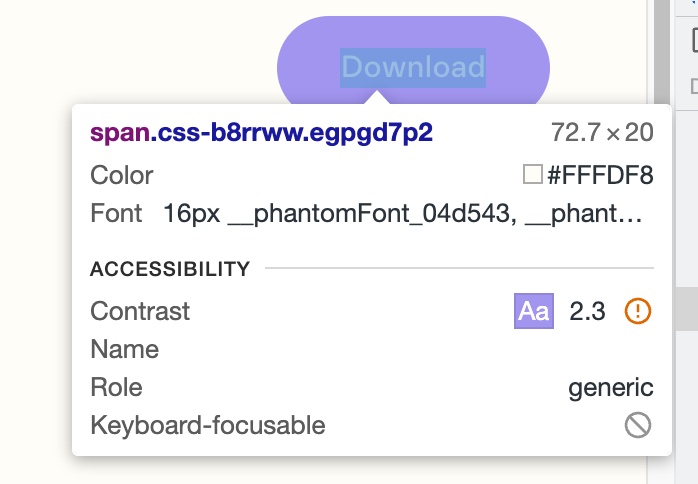 Before the text color adjustment with a bad contrast score of 2.3
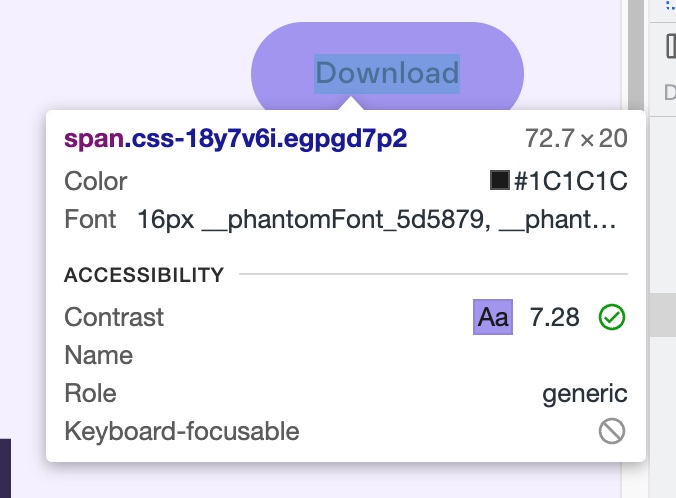 After the text color adjustment with a good contrast score of 7.28
Apart from color contrast, we also need to use the right font size to prevent eye strain. This is particularly beneficial for people with limited vision. For optimal readability, it's often suggested to aim for a font size of around 16 pixels for body text on websites. If you get a design that significantly deviates from this standard, it's always worth addressing it to the designer.
Appropriately sized lines of text also contributes to the user's reading experience. The best line length for readability typically falls between 50 to 75 characters per line, including spaces. This range allows readers to comfortably move from the end of one line to the beginning of the next without losing their place or getting lost in the text. Since websites come in different sizes, it's important to check how the text looks on different screens. On bigger screens, it's usually best to limit how wide the lines are.
6. Alt text for images
Alt text assists those who can't see images—due to visual impairments or image blocking—in understanding the image content. Keep the description brief and accurate. Avoid using 'Image of' or "Picture of" as a start of the alt.
If you don't have control over the content, you can make sure CMS users add alt text by making the alt field required in the CMS. Giving a simple explanation helps content creators understand why alt text is needed and encourages its proper use.
7. ARIA roles and attributes
ARIA (Accessible Rich Internet Applications) attributes and roles provide additional information to assistive technologies about the behaviour and structure of interactive elements. With a ton of different roles and attributes out there, let's zoom in on a handful that we use on the Phantom website:
ARIA labels
The aria-label attribute provides a label or descriptive text for elements
that don't have a visible label. It is particularly helpful for user interface
elements like buttons with icons or cases where the visible text alone does not
provide enough context.
ARIA live
JavaScript allows dynamic changes to specific parts of a web page without
reloading the entire page. For people who can see, these updates are obvious
because they appear right in front of them. However, for someone who is blind
and using a screen reader to navigate the website, these new messages might not
be automatically read out. The aria-live attribute tells the screen reader to
announce these dynamic changes on the page as soon as they happen. This helps
people who can't see the screen stay up-to-date with what's going on.
aria-live can have 3 values:
- aria-live="off": This is the default value and means that the element's content updates are not automatically announced by screen readers.
- aria-live="polite": With this value, screen readers will announce updates that are not essential to the user but are relevant and should be conveyed when the user is not in the middle of a task. The update will be announced when the screen reader is idle.
- aria-live="assertive": When this value is used, screen readers will interrupt the current task and immediately announce the update, as it is considered essential for the user to know.
ARIA controls
The aria-controls attribute is used to associate a control with the element it
controls, allowing assistive technologies to understand the connection and
provide more context to users.
The attribute should be applied to the element that serves as the control (a button, link, or tab) and reference the ID of the element it controls (a dropdown, tab panel, or content section).
/* Play button for the audio player with accessibility attributes. The aria-controls refer to the id of the audio element it's controlling. */
<PlayButton
  onClick={onPlayClick}
  aria-label={isPlaying ? 'Pause' : 'Play'}
  aria-controls={id}
  aria-live="polite"
  isPlaying={isPlaying}
>
  <Icon type={isPlaying ? 'pause' : 'play'} />
</PlayButton>
You can see that the accessibility has been correctly implemented for both the pause and play states:
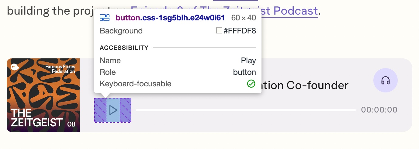 Play state
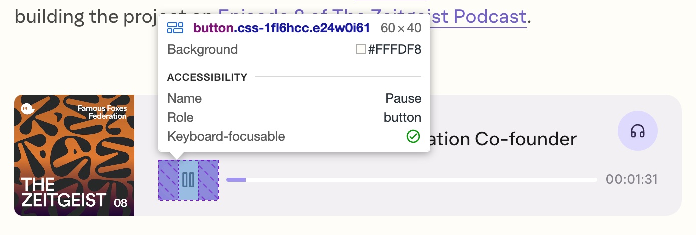 Pause state
ARIA expanded
The aria-expanded attribute indicate the state of an element that can be
expanded or collapsed, such as an accordion, dropdown menu, or collapsible
section. It toggles between two states "true" and "false".
/* Hamburger button to toggle the mobile navigation */
const Hamburger = ({isNavOpen, onClick}: NavHamburgerProps) => {
  return (
    <Button
      onClick={onClick}
      aria-expanded={isNavOpen}
      aria-controls="mobile-nav" {/* Refers to the nav element id */}
      aria-label={isNavOpen ? 'Close menu' : 'Open menu'}
    >
      <PattiesWrap
        variants={pattiesVariants}
        initial="visible"
        animate={isNavOpen ? 'hidden' : 'visible'}
      >
        ...
      </PattiesWrap>

      <CrossWrap
        variants={crossVariants}
        initial="hidden"
        animate={isNavOpen ? 'visible' : 'hidden'}
      >
        ...
      </CrossWrap>
    </Button>
  );
};

/* The mobile navigation */
const SiteNavNarrow = () => {
  <Nav id="mobile-nav">
    <AnimatePresence>...</AnimatePresence>
  </Nav>;
};
If you would like to learn more about ARIA, check out the MDN Web Docs by Mozilla. They provide a comprehensive list of ARIA states and properties along with explanations.
Proper semantics
Using appropriate semantic HTML elements to structure your content not only
assists assistive technologies in understanding your content's structure and
meaning but can also reduce the need for excessive ARIA attributes. For example,
use <nav> for navigation menus, <h1> to <h6> for headings, <button> or
<a> for interactive elements, and so on. Additionally, properly structured
HTML can improve your content's visibility in search engine results and help
users find your website more easily.
Don't:
<span role="button">Submit</span>Do:
<button>Submit</button>Learn more
If you want to learn more about accessibility, and how to include it in your project, visit the website of the the a11y project or read the accessibility series offered by Google developers.